In the first part of the series we covered the basic elements of graphic design with shapes, lines, textures and color among others. Today we go a bit more in-depth and will take a look at the principles of design, which are very important to know because they’re what separate the good designers from the amazing designers. Some of the principles we’ll cover today are applied unconsciously, but they definitely exist and we will show you examples from the web to illustrate the concepts.
1. BalanceBalance is how the elements of a design are distributed throughout a layout. If the balance is good, then stability is assured, although lately many designers go for unbalanced designs because they are dynamic and offer a totally different perspective. The personal pages are the most suitable for slightly off-balanced layouts, and you will see some examples soon.
To be able to notice what kind of balance a website has, you need to know the three types of balance: symmetrical, asymmetrical and radial. The first one takes place when both sides of a design are the same in shape, lines, texture and so on. Because this is the way we design today, this happens most of the time along a vertical axis, so when we talk about the two sides of a design, we talk about left and right. There are also examples along the horizontal axis and sometimes even along both of them, but these are rare. The symmetrical designs are pretty much most of the websites on the internet until 5 years ago.
The second type of balance occurs when the two sides of a website do not look like each other, but still have elements that are similar. Although it is called asymmetrical, they still provide some symmetry, like the first type of balance, only at a lower level. Asymmetrical websites are becomimg more and more popular nowadays (see WordPress layouts with content on one side and sidebar on the other).
The radius balance takes place when design elements are placed in a circular pattern. They give a sense of movement, dynamism, but it is not seen very often on the internet, because even the most experienced designers have problems laying out such a design.
As said earlier, balance is achieved through shapes, colors, textures, lines and the other elements we’ve talked about in the first episode.
 Florida Flourish is a good example of a total symmetric website
 Duplos uses an asymmetrical layout which works really well.2. Dominance and Priority
These two principles are together because they are strongly linked. They both have a lot to do with the user experience because a lack of priority and element dominance can be confusing. The dominance level is the one which prioritizes the importance of different elements, such as menu, logo, content or footer. Sure, this is also done by playing with the font and size, but let’s go a bit deeper and see what dominance and priority mean.
There are three main levels of priority. We have the headline or call to action, which comes as a primary element; then we have the secondary elements like images needed to make a point or, most of the time, the navigation. They are obviously not the most important element of a website, but you can’t do it without them either. The tertiary elements are information like footer links, meta information on blogs or different elements, and a website can most of the time exist without them. However, they are used frquently because they complete the design in different ways, either by offering more information, or by completing the layout with some elements.
 Area17 emphasizes the dominant element in the top left corner and the welcome message pulls you in as well because of the color.3. Proportion
Proportion is important and represents the scale of elements compared to each other. They have a strong effect on the user and are also linked with the previous principle. It is no surprise that larger elements have a stronger impact on the user than the small ones. Dominance, priority and proportion work together to assure the user sees the information properly on a website. Having a larger font in the footer than in the content is a mistake because it does not respect these three principles.
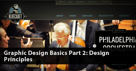
 Bluecated Interactive uses proportion to draw the attention on the image.4. Contrast
This is another important principle not only of design, but also of photography and any other visual art. I don’t think we need to go too deep into this, because everybody knows what contrast means. Having enough contrast between elements makes sure that some of them stand out more than others. If designers wish to blend elements together, they do it by having minimal contrast between them. If the contrast is high, the elements are distinct from each other.
If balance is created through shapes and lines, the contrast can be created through color. However, lately the contrast has also been changed through typography and texture, so this becomes more and more popular. Having perfect typography can help you achieve not only the perfect contrast, but also proportion, dominance and priority. It is easy to see that the last three concepts we’ve talked about are slightly linked to each other in some ways. If we would talk a bit more general about this whole topic, we would be able to put all of them into the same paragraph.
 eHarmony's "Find My Matches" button stands out because of a good use of contrast.5. Rhythm
This might be a new one for you. The rhythm of the page is the principle that makes the human eye move from one element to another. It ensures the flow of the eye and in which order users should see the elements. Now this is a difficult one to make, because everybody has their own way of looking at a website and making all of them do it the same way might be too overwhelming.
There are two types of rhythms: the fluid and the progressive. The first one is a variation and the best example is the movement of water, which flows in the same direction basically, but has a lot of variation in how it moves. The progressive rhythm occurs when there is a clear sequence on how the eye should move between elements.
 David Desandro's portfolio follows a very regular, progressive rhythm6. Harmony and Unity
The last principle of design wants to ensure that even if all the principles above are used properly, it is still impossible to create a stunning design without harmony and unity, and this is quite often seen in real life. We often hear of rich people who have everything they want, but lack harmony and unity in their lives. It is the same rule in design. If all these elements work together properly, then you’ve achieved what we call unity. Only placing all these elements on a page without linking them to each other does not create a design, but a page with a bunch of elements. If the elements complement each other and the website is easy to the eye and offers a good user experience, then the work you’ve done is more or less finished.
There is no really need for an example here, we all know that websites with harmony and unity can be spotted all over the place; think of a website that you like a lot and that you always remember. That’s probably a website that has harmony and unity.
Conclusion
The second article of the series wraps up the process of analyzing the very basic principles of design you really need to know about. After reading the first two articles you pretty much have most of the knowledge you need to start designing your own layout, but wait a bit more. The third and last article of the series comes soon and will cover the basics of composition such as focal point, grid theory, gestalt laws and others which can also be used for products like magazines, flyers or brochures.
Read more in-depth
If this article only satisfied a bit of your curiosity, then I’ve gathered for you few other sources where you can read more about the basic principles of design.
Web Design Symmetry and Asymmetry on 1stwebdesigner.com
How to Use Size, Scale and Proportion in Design on Van SEO Design
Unity in Design on Van SEO Design
Developing Visual Rhythm in Web Design on Tynpanus
Principles of Design: Contrast on Sitepoint
Dominance on Van SEO Design
1. BalanceBalance is how the elements of a design are distributed throughout a layout. If the balance is good, then stability is assured, although lately many designers go for unbalanced designs because they are dynamic and offer a totally different perspective. The personal pages are the most suitable for slightly off-balanced layouts, and you will see some examples soon.
To be able to notice what kind of balance a website has, you need to know the three types of balance: symmetrical, asymmetrical and radial. The first one takes place when both sides of a design are the same in shape, lines, texture and so on. Because this is the way we design today, this happens most of the time along a vertical axis, so when we talk about the two sides of a design, we talk about left and right. There are also examples along the horizontal axis and sometimes even along both of them, but these are rare. The symmetrical designs are pretty much most of the websites on the internet until 5 years ago.
The second type of balance occurs when the two sides of a website do not look like each other, but still have elements that are similar. Although it is called asymmetrical, they still provide some symmetry, like the first type of balance, only at a lower level. Asymmetrical websites are becomimg more and more popular nowadays (see WordPress layouts with content on one side and sidebar on the other).
The radius balance takes place when design elements are placed in a circular pattern. They give a sense of movement, dynamism, but it is not seen very often on the internet, because even the most experienced designers have problems laying out such a design.
As said earlier, balance is achieved through shapes, colors, textures, lines and the other elements we’ve talked about in the first episode.
Florida Flourish is a good example of a total symmetric websiteDuplos uses an asymmetrical layout which works really well.2. Dominance and PriorityThese two principles are together because they are strongly linked. They both have a lot to do with the user experience because a lack of priority and element dominance can be confusing. The dominance level is the one which prioritizes the importance of different elements, such as menu, logo, content or footer. Sure, this is also done by playing with the font and size, but let’s go a bit deeper and see what dominance and priority mean.
There are three main levels of priority. We have the headline or call to action, which comes as a primary element; then we have the secondary elements like images needed to make a point or, most of the time, the navigation. They are obviously not the most important element of a website, but you can’t do it without them either. The tertiary elements are information like footer links, meta information on blogs or different elements, and a website can most of the time exist without them. However, they are used frquently because they complete the design in different ways, either by offering more information, or by completing the layout with some elements.
Area17 emphasizes the dominant element in the top left corner and the welcome message pulls you in as well because of the color.3. ProportionProportion is important and represents the scale of elements compared to each other. They have a strong effect on the user and are also linked with the previous principle. It is no surprise that larger elements have a stronger impact on the user than the small ones. Dominance, priority and proportion work together to assure the user sees the information properly on a website. Having a larger font in the footer than in the content is a mistake because it does not respect these three principles.
Bluecated Interactive uses proportion to draw the attention on the image.4. ContrastThis is another important principle not only of design, but also of photography and any other visual art. I don’t think we need to go too deep into this, because everybody knows what contrast means. Having enough contrast between elements makes sure that some of them stand out more than others. If designers wish to blend elements together, they do it by having minimal contrast between them. If the contrast is high, the elements are distinct from each other.
If balance is created through shapes and lines, the contrast can be created through color. However, lately the contrast has also been changed through typography and texture, so this becomes more and more popular. Having perfect typography can help you achieve not only the perfect contrast, but also proportion, dominance and priority. It is easy to see that the last three concepts we’ve talked about are slightly linked to each other in some ways. If we would talk a bit more general about this whole topic, we would be able to put all of them into the same paragraph.
eHarmony's "Find My Matches" button stands out because of a good use of contrast.5. RhythmThis might be a new one for you. The rhythm of the page is the principle that makes the human eye move from one element to another. It ensures the flow of the eye and in which order users should see the elements. Now this is a difficult one to make, because everybody has their own way of looking at a website and making all of them do it the same way might be too overwhelming.
There are two types of rhythms: the fluid and the progressive. The first one is a variation and the best example is the movement of water, which flows in the same direction basically, but has a lot of variation in how it moves. The progressive rhythm occurs when there is a clear sequence on how the eye should move between elements.
David Desandro's portfolio follows a very regular, progressive rhythm6. Harmony and UnityThe last principle of design wants to ensure that even if all the principles above are used properly, it is still impossible to create a stunning design without harmony and unity, and this is quite often seen in real life. We often hear of rich people who have everything they want, but lack harmony and unity in their lives. It is the same rule in design. If all these elements work together properly, then you’ve achieved what we call unity. Only placing all these elements on a page without linking them to each other does not create a design, but a page with a bunch of elements. If the elements complement each other and the website is easy to the eye and offers a good user experience, then the work you’ve done is more or less finished.
There is no really need for an example here, we all know that websites with harmony and unity can be spotted all over the place; think of a website that you like a lot and that you always remember. That’s probably a website that has harmony and unity.
Conclusion
The second article of the series wraps up the process of analyzing the very basic principles of design you really need to know about. After reading the first two articles you pretty much have most of the knowledge you need to start designing your own layout, but wait a bit more. The third and last article of the series comes soon and will cover the basics of composition such as focal point, grid theory, gestalt laws and others which can also be used for products like magazines, flyers or brochures.
Read more in-depth
If this article only satisfied a bit of your curiosity, then I’ve gathered for you few other sources where you can read more about the basic principles of design.
Web Design Symmetry and Asymmetry on 1stwebdesigner.com
How to Use Size, Scale and Proportion in Design on Van SEO Design
Unity in Design on Van SEO Design
Developing Visual Rhythm in Web Design on Tynpanus
Principles of Design: Contrast on Sitepoint
Dominance on Van SEO Design
that was really nice blog what you shared..that collection gives good information..keep update with your blogs..
ReplyDeletecheap website designers in hyderabad
freelance web designer hyderabad telangana
Low Cost Web designing Company in hyderabad
Low Cost Web designing Companies in hyderabad
Earn 50,000 per month online
ReplyDeleteData entry jobs online 15000/month
Online typing job 25,000/month
Earn money online without investment
Work at home 15,000/month
Part time jobs online
Home based jobs 30,000/month
Work at home daily payment
Ad posting job 15,000/month