In this week’s tutorial we are going to create an eCommerce landing page using Adobe Photoshop. This tutorial is intended for new designers who are planning on designing an eCommerce template. So what are we waiting for? Ready your workspace and let’s get started.
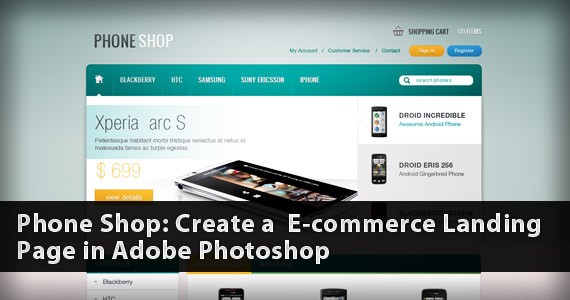
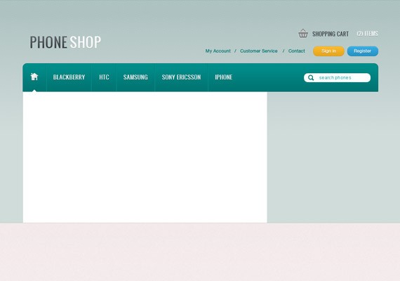
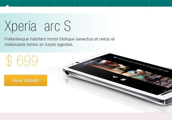
Here is what we will be making, click on the image for full preview:

Resources for this tutorialSearchCart IconSocial IconsPhone IconsPatternIconsweetsStep 1: Setting up the DocumentStart by creating a 1400px x 1900px document in Photoshop.
Ruler Tool is very useful for this tutorial. Make sure that rulers and guides are turned on.
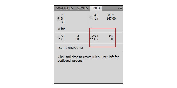
Rulers: Ctrl + RGuides: Ctrl + ;One thing important in using Ruler Tool is the Information Panel. The use of this is when you are measuring using the ruler, the information will be shown in the information panel. Make sure that this is shown in your panel at the right. If it is not shown you can access this by going to Windows – Info.
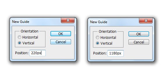
The total width of this site will be 960px. So, let’s create our first guide by going to View – New Guide, set the value to 220px. Create another guide, but now change the value to 1180px, this will make a total of 960px to the center of our canvas.
Step 2: Working on Background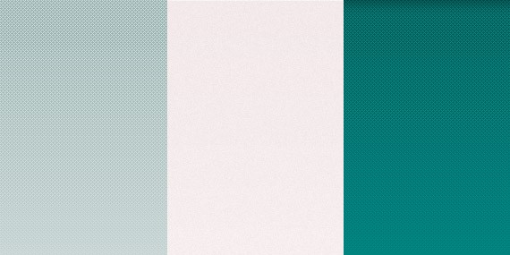
As you can see in the full preview above, the template was divided into three backgrounds, first on the top which holds the logo, navigation and slider. Second a noise background that holds the products, and third on the footer area.
First Background: Using Rectangle Tool(U) color #b6c9c9 create a 100% by 600px. Download the pattern provided in the resource because we will be applying a pattern overlay to the shape we have just created.
Apply this Blending Option
Pattern Overlay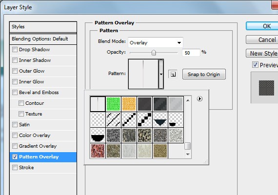
Second background: using the same tool create a 100% by 1010px shape.
Apply this Blending Option
Inner Shadow: #fff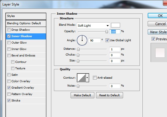
Gradient Overlay: #fff, #f2e9e9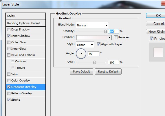
Stroke: #c7c3c3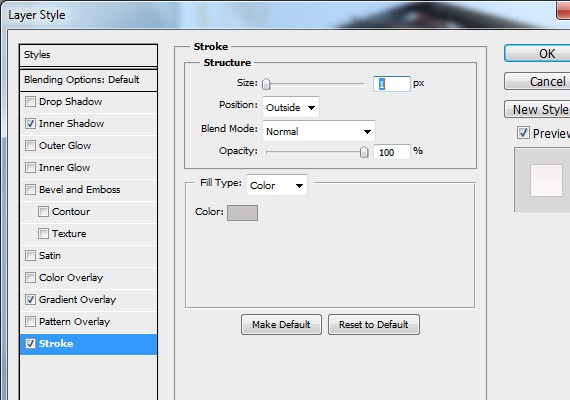
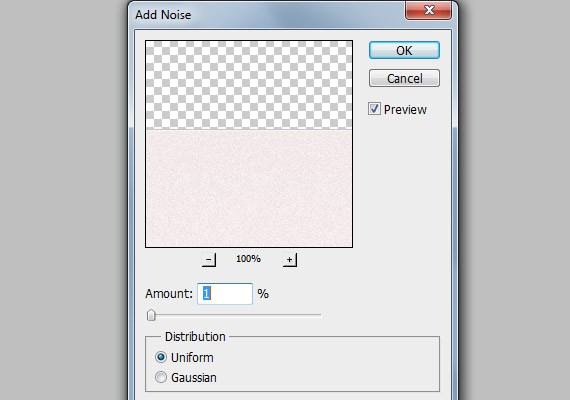
Let’s add a noise to this shape by going to Filter – Convert For smart filters. Again, go to Filter – Noise – Add Noise.
Third background: using the same tool fill the remaining area with #007573.
Apply this Blending Option
Inner Shadow: #000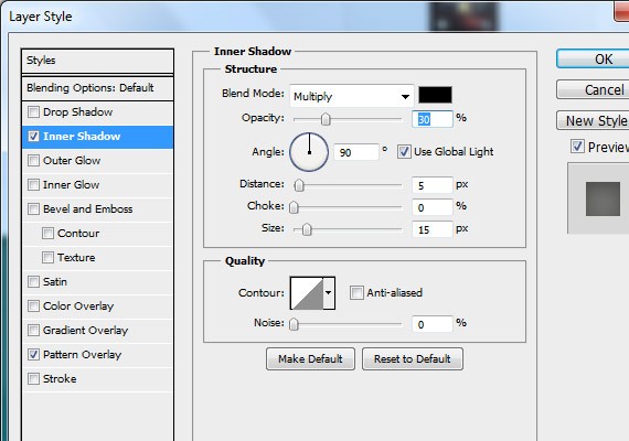
Pattern Overlay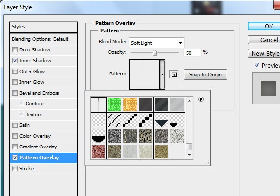
Result!
Step 3: Working on the Header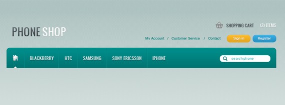
The header for this template will contain the logo, navigation links, buttons, search and shopping cart.
LogoI used a font called Oswald which can be found in Google Fonts. Using Text Tool(T) 36pt place our logo in a separate word Phone & Shop. The distance will be 100px below starting from the top of the canvas and 20px from the left starting guide.
Phone: Apply this Blending Option
Gradient Overlay: #383e44, #5c636a
Shop: Apply this Blending Option
Drop Shadow: #000
Gradient Overlay: #f6f3f3, #fff
Result

Main Navigation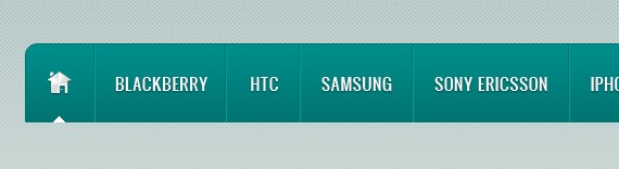
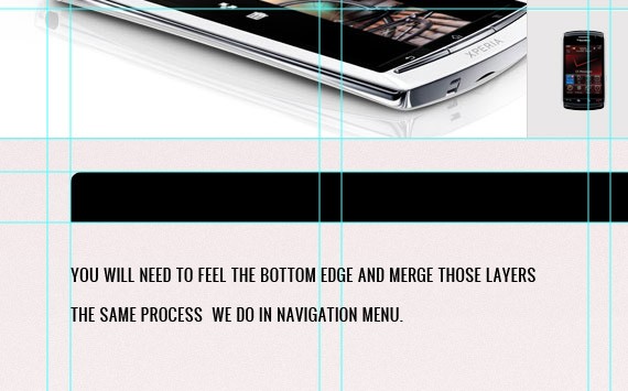
Notice our navigation has rounded corners on the upper left and right corners. First thing to do is select Rounded Rectangle Tool(U) and set the Radius to 10px. Create a 960px by 75px shape, place it 40px below the logo. Now that it is properly placed create another layer above it and fill the rounded corners in the bottom part. Once you have done it merge this two layers.

Apply this Blending Option
Gradient Overlay: #007472, #008e8b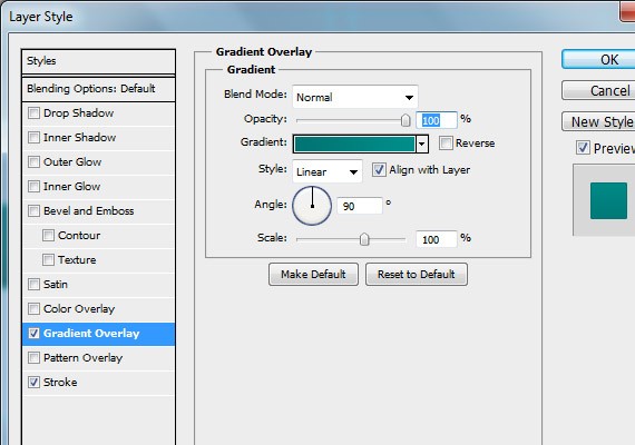
Stroke: #007472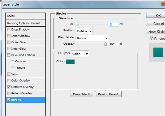
Result

Open up the Iconsweets icon set and grab the home logo and place it as shown in the screenshot below.

Apply this Blending Option
Drop Shadow: #000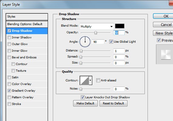
Gradient Overlay: 0% #fff, 20% #dbdada, 40% #fff, 60% #dbdada, 80% #fff, 100% #dbdada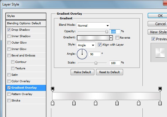
Result
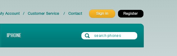
Next we will add our Dividers. Select Line Tool(U) and create 2 1px lines. First line color will be #007472 and #009c9a for the second line. Place it 20px from the right of the logo.

Next is adding our navigation links. For this tutorial the links are BLACKBERRY, HTC, SAMSUNG, SONY ERICSSON, IPHONE. Font will be Oswald 15pt color #fff. The distance of each link will be 20px left and right from the Separators/ Dividers. I will leave it up to you to measure it using Ruler Tool(I). Also, add the same Drop Shadow as we did in our home logo.
Last thing we need to make is the hover state. We will just make an small arrow head facing the navigation links, to do this create a shape as shown in the screenshot below using Pecil Tool(B) in a separate layer.
Search
Select Rounded Rectangle Tool, set the Radius to 20px and also make the fill color to #fff. Once it is set create a 180px by 25px shape as shown in the screenshot below.

Apply this Blending Option
Inner Shadow: #007472
Label the search bar with text search phones using Text Tool. The text format will be Arial 12pt color #009c9a. Then lastly open up the search icon, resize it and place it as shown in the screenshot below. Search icon color will be #007472.

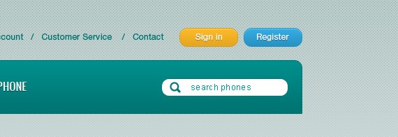
Top Navigation (Register & Login buttons)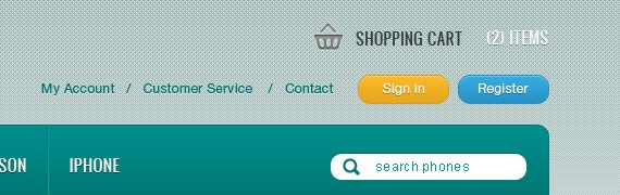
For the text links I used Helvetica 12pt color #007472. Add it using Text Tool. Next select Rounded Rectangle Tool(U) set the Radius to 20px create a two 80px by 25px shape and label it with text Helvetica 12pt color #fff.
First Shape: Apply this Blending Option
Inner Shadow: #fff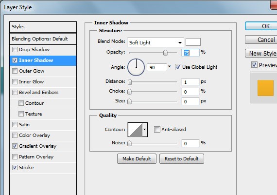
Gradient Overlay: #e5a61f, #fbb829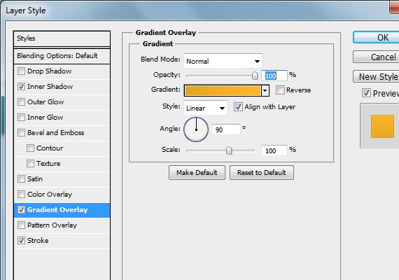
Stroke: #d69d23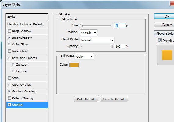
For the label text add a 1px Drop Shadow 30%.
Result!
Second Shape: Apply this Blending Option
Inner Shadow: #fff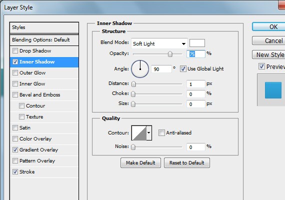
Gradient Overlay: #2792c3, #34abe1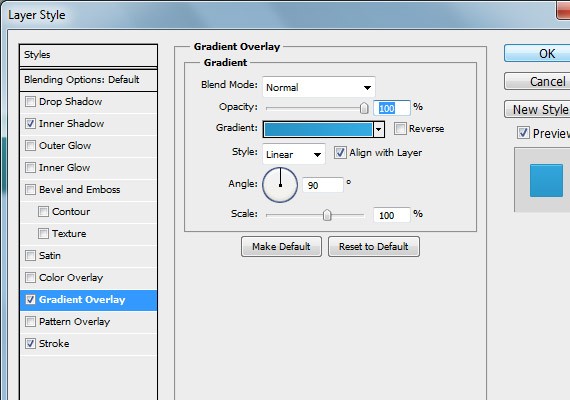
Stroke: #2792c3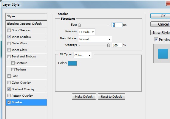
For the label text add a 1px Drop Shadow 30%.
Result!
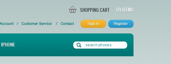
Next add the Cart icon, so go ahead and place it as shown in the screenshot below. For the text I used Oswald 14pt color #383e44, #fff and I added a Drop Shadow 30% to the #fff text.
Step 4: Working on Slider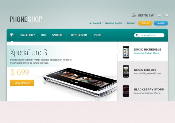
This slider will contain a slideshow image for a specific post with title, description, price, and a button to link to that specific post. This slideshow will have 3 tabs for the purpose of navigating and switching specific posts. So let’s get started!
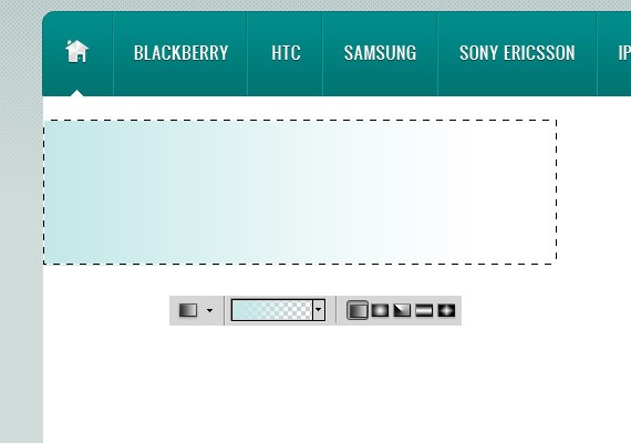
Slider PreviewStart by creating a 660px by 355px shape using Rectangle Tool(U).
Set the Foreground color to #c2e7e7. Next using Rectangular Marquee Tool(M) create a 460px by 130px selection. Next, select Gradient Tool(G) and set the gradient to foreground to transparent. Once it is set, fill the slection.
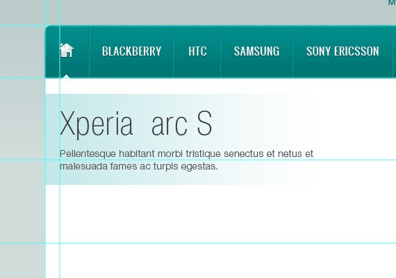
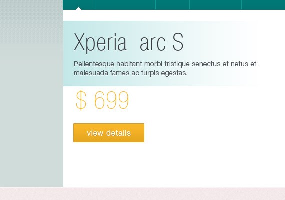
We will be adding title and description to the highlighted part using Text Tool(T). I used Helvetica Condensed 48pt color #383e44 for the Title and Helvetica Light 14pt color #50565c for the description.
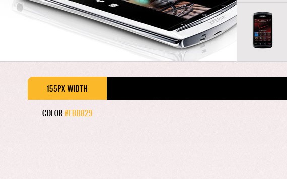
For the price text I used Helvetica Ultra Light 48pt color #fbb829. For the view details button create a 140px by 45px shape using Rectangle Tool(U) and apply the same blending option as we did in the sign in button. The label text size will be 16pt.
Lastly you will need to add a sample image preview.
TabsUsing Rectangle Tool(U) create a 3 300px by 122px shape as shown in the screenshot below. For the first shape make it #fff and for the two remaining shape make it #e9e7e7.
Now we will be adding lines using Line Tool(U) to make the tabs looks solid and cool. So using Line Tool(U) create a lines as shown in the screenshot below. Line color I used is #d9d2d2 and #f5f5f5.
Notice in the preview of the slideshow in the first tab there is an arrow head indicating it is the active state. To do that select Pencil Tool(B) set the color to #d9d2d2. Refer to the screenshot below for you to know how I did it.
Next we will fill the tabs with text and the phone Icon. Download phone icons from the resource I provided and place it as shown in the screen below.
For the active state text I used Helvetica Bold 16pt color #383e44 for the title and Helvetica Thin 13pt color #009c9a for the description.
For the non active tabs I used the same size and color but for the description text color will be #50565c.
Text: Apply this Blending Option
Drop Shadow: #fff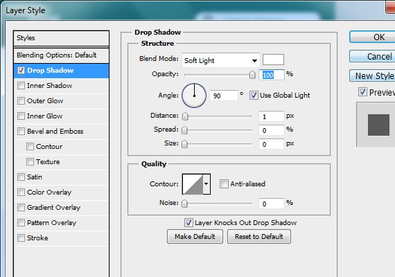
Result!
Shadows & HighlightsCreate a selection as shown in the screenshot below and fill it with Linear Gradient foreground to transparent.
Mask the layer by clicking the mask icon from the layers panel. Now using Brush Tool paint the top area to make the shadow fades. Then lastly you will need to set the Opacity to 20%.
Duplicate the shadow layer and place it on the other side. Next thing, make a selection as shown in the screenshot below and use Radial Gradient to fill it with #fff gradient. Then, change the Blend mode to Soft Light.
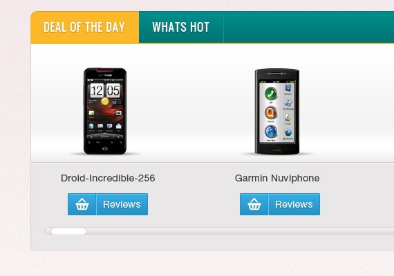
Step 5: Working on Featured Product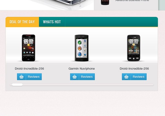
We are going to divide 960px into 4 columns with 20px distance with each column from the right. Refer to the screenshot below for the guide lines measurements.
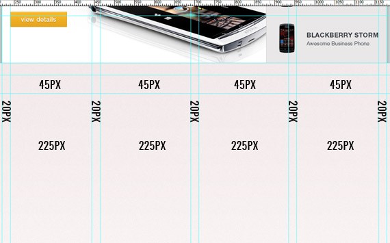
The first column will be for our sidebar and the rest will be the width of the featured products. The 45px measurement will be the height of the tabs. Using Rounded Rectangle Tool(U) set the radius to 10px and create a shape as shown in the screenshot below.
For the first tab you will need to duplicate the layer and cut out the not including area. Refer to the screenshot below.
Apply this Blending Option
Inner Shadow: #000
For the base layer apply the same blending option as we did in our main navigation. Also, font style and dividers are the same.
Lastly add a 3px border on the bottom color #fbb829.
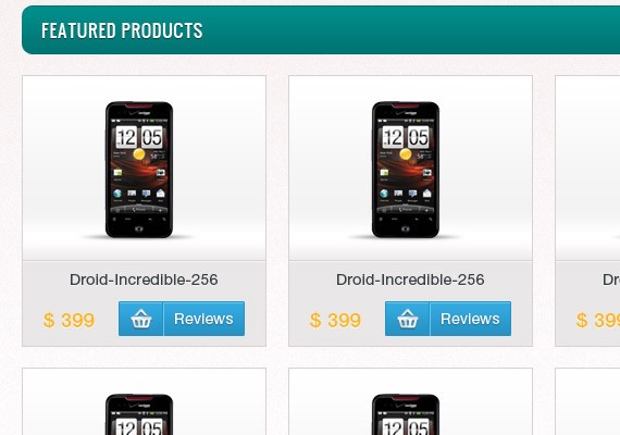
Next we will create the base layer to hold the featured products. Select Rectangle Tool(U) create a 715px by 300px shape.
Apply this Blending Option
Stroke: #d9d2d2
Gradient Overlay: 0% #e9e7e7, 40% #e9e7e7, 50% #fff, 60% #f3f3f3, 100% #ffffff
Result!
Using Line Tool(U) add two 1px lines as shown in the screenshot below. Top line color #d9d2d2, bottom line color #f5f5f5.
Place a phone icon at the center in the second column and behind the phone create a selection at the very bottom as shown in the screenshot below and fill it with #000. Once you have fill it go to Filter – Blur – Gaussian Blur 1px.
Next create a 115px by 30px shape using Rectangle Tool. Apply the same blending option as we did in our register button. Refer to the screenshot below for more info of making the button.
Using Text Tool(T) add the name of the product. Text format will be Helvetica 14pt color #383e44. Place it as shown in the screenshot below and once you have done it group all the layer and duplicate it two times and place it accordingly for the third and fourth columns.
Next we will create a horizontal scroll. Using Rounded Rectangle Tool(U) set the radius to 20px and create a shape as shown in the screenshot below.
Apply this Blending Option
Drop Shadow: #fff
Gradient Overlay: #dbd8d8, #f5efef
Stroke: #d9d2d2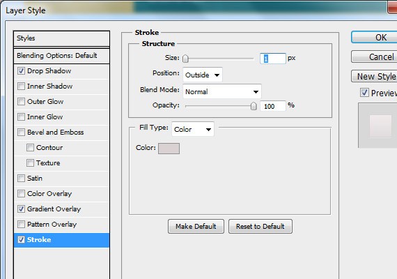
Create another shape using Rounded Rectangle Tool(U) as shown in the screenshot below. Apply the stroke as we did in the first shape.
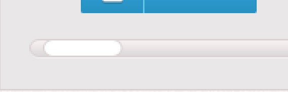
Result
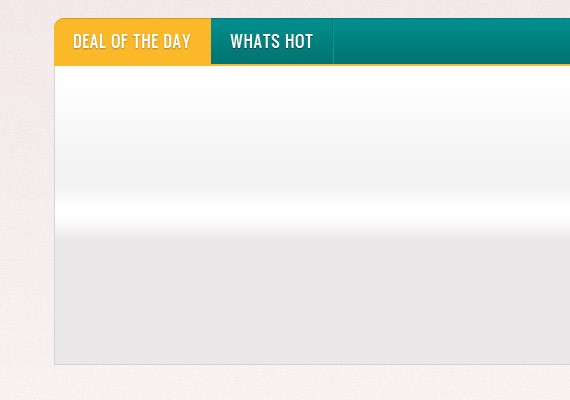
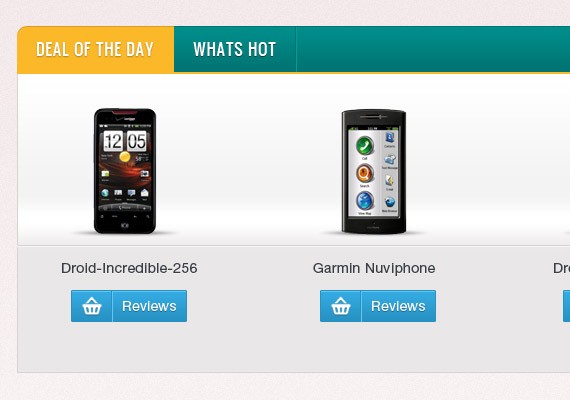
Step 6: Working on Products List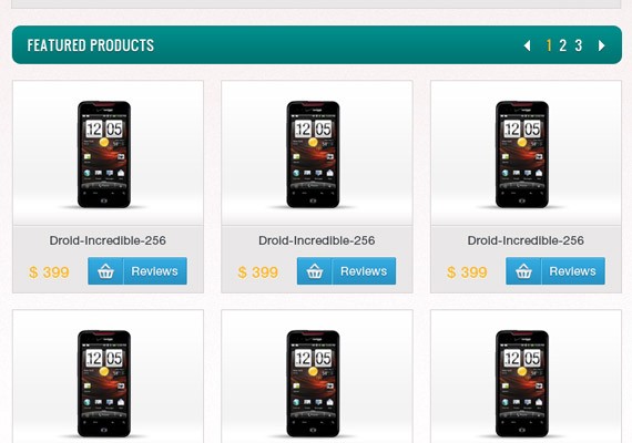
In this part I will not go on to detail because all styles here are the same on the featured product section. I will just walk on to an overview on how I did it.
Header Part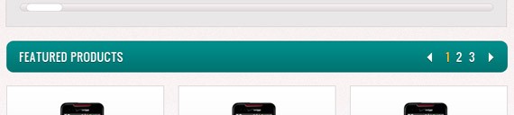
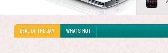
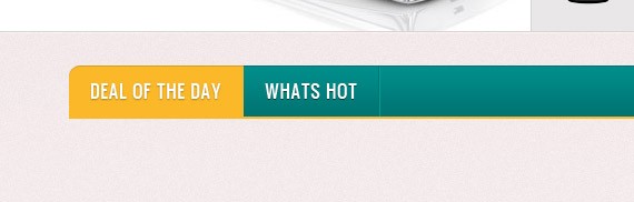
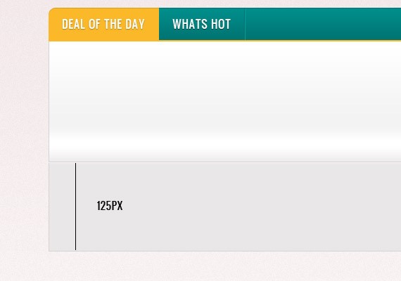
In here I created 45px of height shape using Rounded Rectangle Tool(U) and applied the same blending option as we did in main navigation & tabs. Text format are the same and styles. Notice at the right side there is an arrow and numbers. For the arrow I created this using Pencil Tool(B) and applied the same drop shadow as we did on every text. For the active number I used color #fbb829. Also for the distance from featured product & product list is 20px.
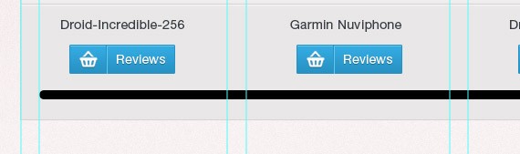
In this part all styles are copied from the featured product, so I will leave it up to you. height of each product list will be 250px. I moved the button on the right part and added a price on the left part. Distance from the boundary box will be 20px. The text format for the prize is Helvetica 18pt color #fbb829.
Step 7: Working on Sidebar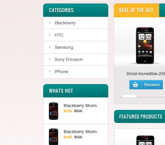
Sidebar will contain a Category list & What’s Hot list. Again I will not go on to detail in doing this Il just walk you through it.
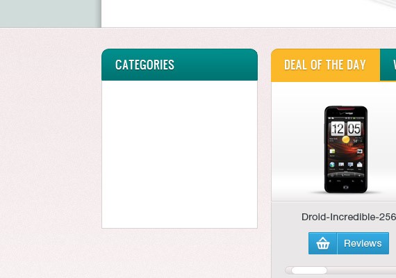
Categories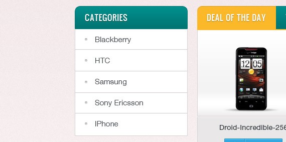
In the header part size of the header is 45px, the same text style and format.
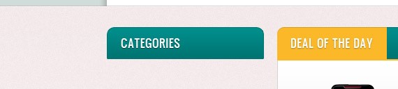
The height of the base will be 215px and I apply 1px stroke color #d9d2d2
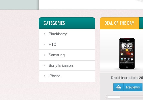
Next I added a the list of categories using Text Tool(T). Text format will be Helvetica 15pt color #50565c. I also make a divider using Line Tool(U) color ##d9d2d2. The distance will be 15px top and bottom for the text. Just refer to the screenshot below.

Next I added a bullet using Ellipse Tool(U) fill color #d9d2d2.
Apply this Blending Option
Inner Shadow: #000
Result!
What’s Hot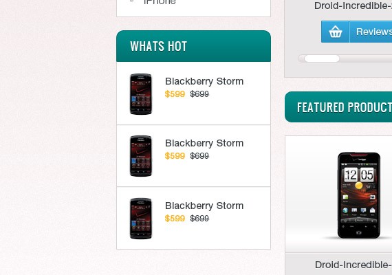
In this part it is just a copy of categories section and I added a phone icon and price. So I will leave it up to you. Text, color, distance will be the same.
Step 8: Working on Footer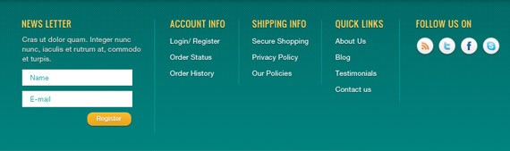
Footer section will be divided into 5 columns this will contain News letter, Account Info, Shipping Info, Quick Links, and Follow us.
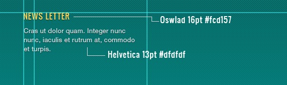
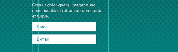
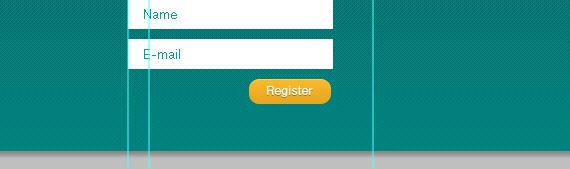
News LetterUsing Text Tool(T) add the following text as shown in the screenshot below.
Using Rectangle Tool(U) create two 205px by 30px shape with a distance of 10px and label it “Name & Email” using Text Tool(T). Text format will be Helvetica 13pt color #009c9a.
Next grab a copy of sign in button and uncheck the stroke from the blending options. Change the label to Register and place it as shown in the screenshot below.
Account Info, Shipping Info, Quick LinksFor the header I used the same format as we did in the news letter. The links will be Helvetica 13pt color #fff. Dividers distance for each block is 25px and the dividers color is #009c9a.
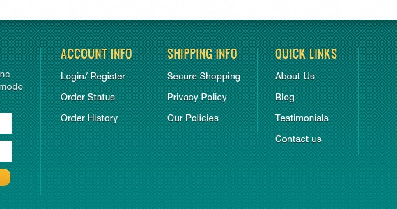
Follow UsIn here still the same header format and then you will need to download the social icons and place them accordingly.
Social Icons: Apply this Blending Option
Drop Shadow: #000
And finally we’re done. I hope you learned something from this tutorial and may this tutorial help you in your future projects. For beginning designers I hope you followed this and if you have something to ask just drop it below. Thank you for reading and godless everyone. :)
Final Preview
Download PSD file here.
Here is what we will be making, click on the image for full preview:
Resources for this tutorialSearchCart IconSocial IconsPhone IconsPatternIconsweetsStep 1: Setting up the DocumentStart by creating a 1400px x 1900px document in Photoshop.
Ruler Tool is very useful for this tutorial. Make sure that rulers and guides are turned on.
Rulers: Ctrl + RGuides: Ctrl + ;One thing important in using Ruler Tool is the Information Panel. The use of this is when you are measuring using the ruler, the information will be shown in the information panel. Make sure that this is shown in your panel at the right. If it is not shown you can access this by going to Windows – Info.
The total width of this site will be 960px. So, let’s create our first guide by going to View – New Guide, set the value to 220px. Create another guide, but now change the value to 1180px, this will make a total of 960px to the center of our canvas.
Step 2: Working on Background
As you can see in the full preview above, the template was divided into three backgrounds, first on the top which holds the logo, navigation and slider. Second a noise background that holds the products, and third on the footer area.
First Background: Using Rectangle Tool(U) color #b6c9c9 create a 100% by 600px. Download the pattern provided in the resource because we will be applying a pattern overlay to the shape we have just created.
Apply this Blending Option
Pattern Overlay
Second background: using the same tool create a 100% by 1010px shape.
Apply this Blending Option
Inner Shadow: #fff
Gradient Overlay: #fff, #f2e9e9
Stroke: #c7c3c3
Let’s add a noise to this shape by going to Filter – Convert For smart filters. Again, go to Filter – Noise – Add Noise.
Third background: using the same tool fill the remaining area with #007573.
Apply this Blending Option
Inner Shadow: #000
Pattern Overlay
Result!
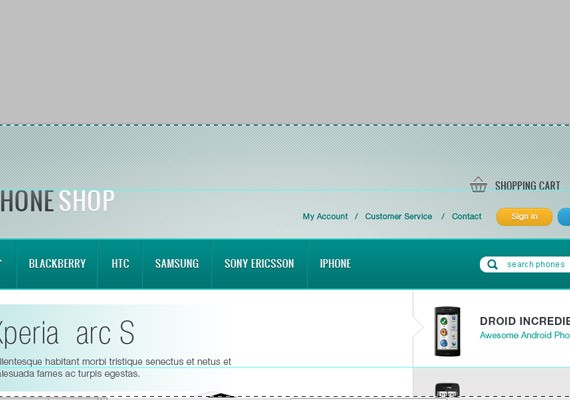
Step 3: Working on the Header
The header for this template will contain the logo, navigation links, buttons, search and shopping cart.
LogoI used a font called Oswald which can be found in Google Fonts. Using Text Tool(T) 36pt place our logo in a separate word Phone & Shop. The distance will be 100px below starting from the top of the canvas and 20px from the left starting guide.
Phone: Apply this Blending Option
Gradient Overlay: #383e44, #5c636a
Shop: Apply this Blending Option
Drop Shadow: #000
Gradient Overlay: #f6f3f3, #fff
Result
Main Navigation
Notice our navigation has rounded corners on the upper left and right corners. First thing to do is select Rounded Rectangle Tool(U) and set the Radius to 10px. Create a 960px by 75px shape, place it 40px below the logo. Now that it is properly placed create another layer above it and fill the rounded corners in the bottom part. Once you have done it merge this two layers.
Apply this Blending Option
Gradient Overlay: #007472, #008e8b
Stroke: #007472
Result
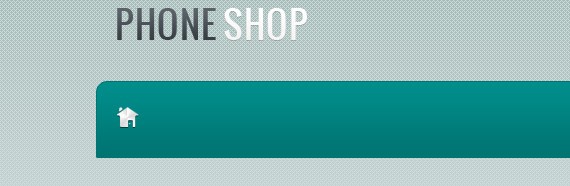
Open up the Iconsweets icon set and grab the home logo and place it as shown in the screenshot below.
Apply this Blending Option
Drop Shadow: #000
Gradient Overlay: 0% #fff, 20% #dbdada, 40% #fff, 60% #dbdada, 80% #fff, 100% #dbdada
Result
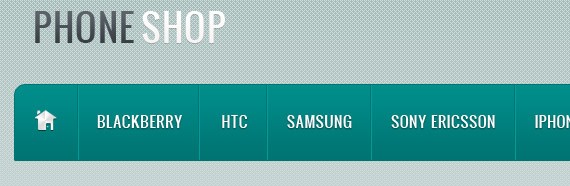
Next we will add our Dividers. Select Line Tool(U) and create 2 1px lines. First line color will be #007472 and #009c9a for the second line. Place it 20px from the right of the logo.
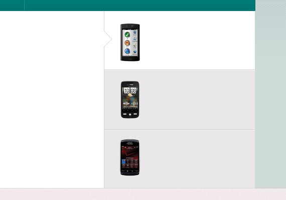
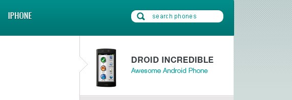
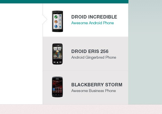
Next is adding our navigation links. For this tutorial the links are BLACKBERRY, HTC, SAMSUNG, SONY ERICSSON, IPHONE. Font will be Oswald 15pt color #fff. The distance of each link will be 20px left and right from the Separators/ Dividers. I will leave it up to you to measure it using Ruler Tool(I). Also, add the same Drop Shadow as we did in our home logo.
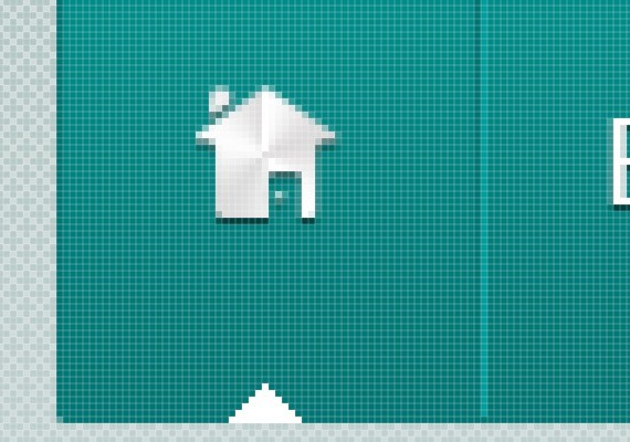
Last thing we need to make is the hover state. We will just make an small arrow head facing the navigation links, to do this create a shape as shown in the screenshot below using Pecil Tool(B) in a separate layer.
Search
Select Rounded Rectangle Tool, set the Radius to 20px and also make the fill color to #fff. Once it is set create a 180px by 25px shape as shown in the screenshot below.
Apply this Blending Option
Inner Shadow: #007472
Label the search bar with text search phones using Text Tool. The text format will be Arial 12pt color #009c9a. Then lastly open up the search icon, resize it and place it as shown in the screenshot below. Search icon color will be #007472.
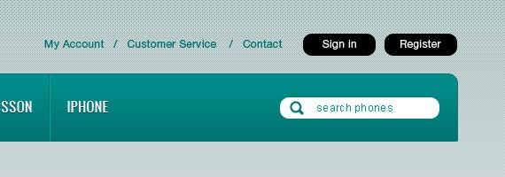
Top Navigation (Register & Login buttons)
For the text links I used Helvetica 12pt color #007472. Add it using Text Tool. Next select Rounded Rectangle Tool(U) set the Radius to 20px create a two 80px by 25px shape and label it with text Helvetica 12pt color #fff.
First Shape: Apply this Blending Option
Inner Shadow: #fff
Gradient Overlay: #e5a61f, #fbb829
Stroke: #d69d23
For the label text add a 1px Drop Shadow 30%.
Result!
Second Shape: Apply this Blending Option
Inner Shadow: #fff
Gradient Overlay: #2792c3, #34abe1
Stroke: #2792c3
For the label text add a 1px Drop Shadow 30%.
Result!
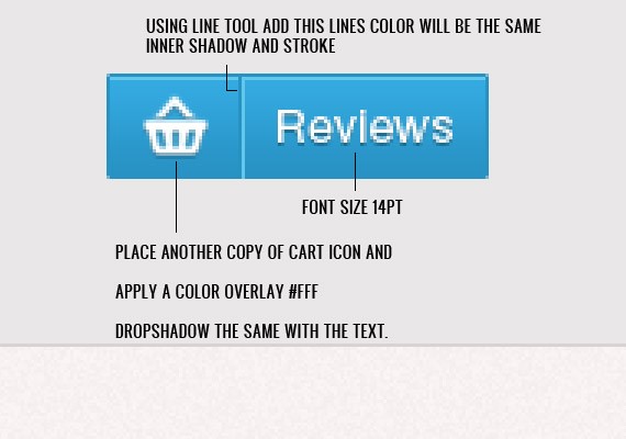
Next add the Cart icon, so go ahead and place it as shown in the screenshot below. For the text I used Oswald 14pt color #383e44, #fff and I added a Drop Shadow 30% to the #fff text.
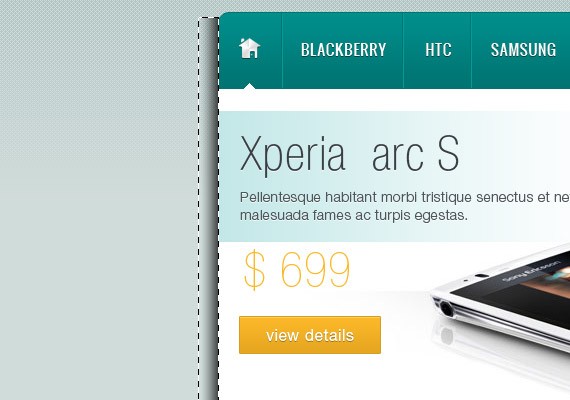
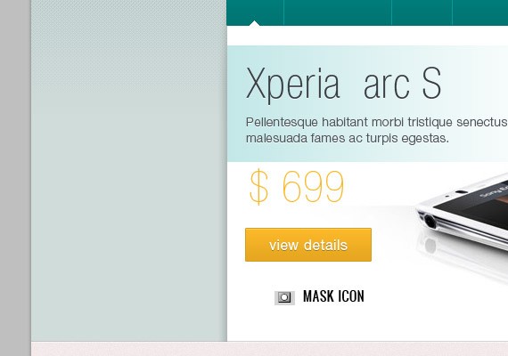
Step 4: Working on Slider
This slider will contain a slideshow image for a specific post with title, description, price, and a button to link to that specific post. This slideshow will have 3 tabs for the purpose of navigating and switching specific posts. So let’s get started!
Slider PreviewStart by creating a 660px by 355px shape using Rectangle Tool(U).
Set the Foreground color to #c2e7e7. Next using Rectangular Marquee Tool(M) create a 460px by 130px selection. Next, select Gradient Tool(G) and set the gradient to foreground to transparent. Once it is set, fill the slection.
We will be adding title and description to the highlighted part using Text Tool(T). I used Helvetica Condensed 48pt color #383e44 for the Title and Helvetica Light 14pt color #50565c for the description.
For the price text I used Helvetica Ultra Light 48pt color #fbb829. For the view details button create a 140px by 45px shape using Rectangle Tool(U) and apply the same blending option as we did in the sign in button. The label text size will be 16pt.
Lastly you will need to add a sample image preview.
TabsUsing Rectangle Tool(U) create a 3 300px by 122px shape as shown in the screenshot below. For the first shape make it #fff and for the two remaining shape make it #e9e7e7.
Now we will be adding lines using Line Tool(U) to make the tabs looks solid and cool. So using Line Tool(U) create a lines as shown in the screenshot below. Line color I used is #d9d2d2 and #f5f5f5.
Notice in the preview of the slideshow in the first tab there is an arrow head indicating it is the active state. To do that select Pencil Tool(B) set the color to #d9d2d2. Refer to the screenshot below for you to know how I did it.
Next we will fill the tabs with text and the phone Icon. Download phone icons from the resource I provided and place it as shown in the screen below.
For the active state text I used Helvetica Bold 16pt color #383e44 for the title and Helvetica Thin 13pt color #009c9a for the description.
For the non active tabs I used the same size and color but for the description text color will be #50565c.
Text: Apply this Blending Option
Drop Shadow: #fff
Result!
Shadows & HighlightsCreate a selection as shown in the screenshot below and fill it with Linear Gradient foreground to transparent.
Mask the layer by clicking the mask icon from the layers panel. Now using Brush Tool paint the top area to make the shadow fades. Then lastly you will need to set the Opacity to 20%.
Duplicate the shadow layer and place it on the other side. Next thing, make a selection as shown in the screenshot below and use Radial Gradient to fill it with #fff gradient. Then, change the Blend mode to Soft Light.
Step 5: Working on Featured Product
We are going to divide 960px into 4 columns with 20px distance with each column from the right. Refer to the screenshot below for the guide lines measurements.
The first column will be for our sidebar and the rest will be the width of the featured products. The 45px measurement will be the height of the tabs. Using Rounded Rectangle Tool(U) set the radius to 10px and create a shape as shown in the screenshot below.
For the first tab you will need to duplicate the layer and cut out the not including area. Refer to the screenshot below.
Apply this Blending Option
Inner Shadow: #000
For the base layer apply the same blending option as we did in our main navigation. Also, font style and dividers are the same.
Lastly add a 3px border on the bottom color #fbb829.
Next we will create the base layer to hold the featured products. Select Rectangle Tool(U) create a 715px by 300px shape.
Apply this Blending Option
Stroke: #d9d2d2
Gradient Overlay: 0% #e9e7e7, 40% #e9e7e7, 50% #fff, 60% #f3f3f3, 100% #ffffff
Result!
Using Line Tool(U) add two 1px lines as shown in the screenshot below. Top line color #d9d2d2, bottom line color #f5f5f5.
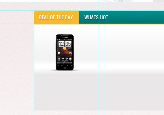
Place a phone icon at the center in the second column and behind the phone create a selection at the very bottom as shown in the screenshot below and fill it with #000. Once you have fill it go to Filter – Blur – Gaussian Blur 1px.
Next create a 115px by 30px shape using Rectangle Tool. Apply the same blending option as we did in our register button. Refer to the screenshot below for more info of making the button.
Using Text Tool(T) add the name of the product. Text format will be Helvetica 14pt color #383e44. Place it as shown in the screenshot below and once you have done it group all the layer and duplicate it two times and place it accordingly for the third and fourth columns.
Next we will create a horizontal scroll. Using Rounded Rectangle Tool(U) set the radius to 20px and create a shape as shown in the screenshot below.
Apply this Blending Option
Drop Shadow: #fff
Gradient Overlay: #dbd8d8, #f5efef
Stroke: #d9d2d2
Create another shape using Rounded Rectangle Tool(U) as shown in the screenshot below. Apply the stroke as we did in the first shape.
Result
Step 6: Working on Products List
In this part I will not go on to detail because all styles here are the same on the featured product section. I will just walk on to an overview on how I did it.
Header Part
In here I created 45px of height shape using Rounded Rectangle Tool(U) and applied the same blending option as we did in main navigation & tabs. Text format are the same and styles. Notice at the right side there is an arrow and numbers. For the arrow I created this using Pencil Tool(B) and applied the same drop shadow as we did on every text. For the active number I used color #fbb829. Also for the distance from featured product & product list is 20px.
In this part all styles are copied from the featured product, so I will leave it up to you. height of each product list will be 250px. I moved the button on the right part and added a price on the left part. Distance from the boundary box will be 20px. The text format for the prize is Helvetica 18pt color #fbb829.
Step 7: Working on Sidebar
Sidebar will contain a Category list & What’s Hot list. Again I will not go on to detail in doing this Il just walk you through it.
Categories
In the header part size of the header is 45px, the same text style and format.
The height of the base will be 215px and I apply 1px stroke color #d9d2d2
Next I added a the list of categories using Text Tool(T). Text format will be Helvetica 15pt color #50565c. I also make a divider using Line Tool(U) color ##d9d2d2. The distance will be 15px top and bottom for the text. Just refer to the screenshot below.
Next I added a bullet using Ellipse Tool(U) fill color #d9d2d2.
Apply this Blending Option
Inner Shadow: #000
Result!
What’s Hot
In this part it is just a copy of categories section and I added a phone icon and price. So I will leave it up to you. Text, color, distance will be the same.
Step 8: Working on Footer
Footer section will be divided into 5 columns this will contain News letter, Account Info, Shipping Info, Quick Links, and Follow us.
News LetterUsing Text Tool(T) add the following text as shown in the screenshot below.
Using Rectangle Tool(U) create two 205px by 30px shape with a distance of 10px and label it “Name & Email” using Text Tool(T). Text format will be Helvetica 13pt color #009c9a.
Next grab a copy of sign in button and uncheck the stroke from the blending options. Change the label to Register and place it as shown in the screenshot below.
Account Info, Shipping Info, Quick LinksFor the header I used the same format as we did in the news letter. The links will be Helvetica 13pt color #fff. Dividers distance for each block is 25px and the dividers color is #009c9a.
Follow UsIn here still the same header format and then you will need to download the social icons and place them accordingly.
Social Icons: Apply this Blending Option
Drop Shadow: #000
And finally we’re done. I hope you learned something from this tutorial and may this tutorial help you in your future projects. For beginning designers I hope you followed this and if you have something to ask just drop it below. Thank you for reading and godless everyone. :)
Final Preview
Download PSD file here.
No comments:
Post a Comment