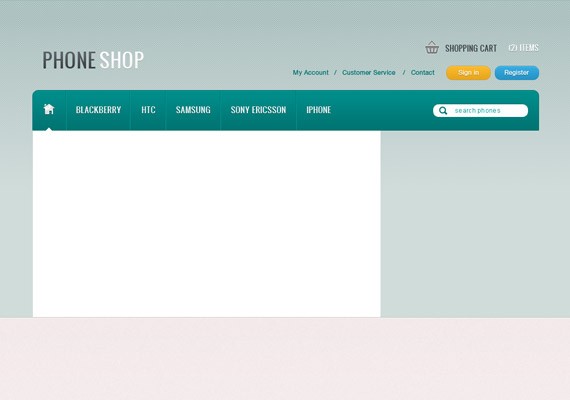
In order to succeed as a freelancer and build a successful brand, website creation is paramount to displaying a professional image. WordPress makes it easy for freelancers to build beautiful, professional websites that are not only impressive to potential clients, but also easy to manage and customize.
The right WordPress theme can make or break your website, so its important to choose one that is clear, concise, simple to navigate and overall generally pleasing to the visitor.
Below are some of my picks (free and premium) for the hottest WordPress themes for freelancers:
1. Typominima – Free
Typominima is a great theme for freelancers who want to spotlight their writing and publishing experience. It’s a simple, clean design that can be used to showcase a writing portfolio or simply to use as a blog in conjunction with a freelance writing business. The theme also includes some design customization options.
2. Boldly – Free Download Here
Boldy is a simple, yet robust WordPress theme by Site5.com. It comes with helpful features such as a theme options page, Ajax-based contact form and a Nivo slider. This theme is perfect for the freelancer who wants to start a professional website that lists everything a potential client needs to know.
3. Fotofolio Landscape – FreeDownload Here
Fotofolio Landscape is a WordPress theme designed by Wordspop.com for photographers to showcase their work to clients. This theme would also do well showcasing a designer’s work.
4. Suburbia – Free
Suburbia is a great fit for a freelancer who is interested in showcasing magazine work or a blog. The design is simple and minimalistic and it also has some flexibility such as a logo uploader and a theme options page.
5. Smashing Multimedia – Free
Smashing Multimedia was designed by Smashing Magazine for podcasters, videographers and photographers or anyone who needs to easily embed videos and images, rate them and showcase them in their own blog. The theme comes with layered PSD source files and a help guide as well.
6. Businezz – Free
If you are looking for a “corporate-looking” theme, this design will meet your needs. The home page includes testimonials and real-time news updates from your blog showcased in a clean and crisp layout.
7. Berita – Free
One of my top picks in the “free” category, this theme is simple and easy to navigate. It is a great starter theme for those freelancers who are transitioning to building a company brand for their services. It has a casual feel, yet it allows you to showcase your work and your services in a professional way.
8. Strange – Premium
I like this premium theme because it works for either portfolio-based content or a business website. It offers a variety of customization options that are easy to change even for the novice user. You can modify layout, styling, colors, sidebars and fonts directly from the backend admin.
9. U-Design – Premium
I am slightly biased with this premium theme because I use it for my personal website. I love the clean design and the many layouts available. It is built with SEO in mind as it relates to content placement on the home page and it offers easy customization of colors for backgrounds, links, text, menu links, etc. I have had the theme for a month and I am still finding new ways to customize the site to complete it. It gets a “thumbs up” in my book.
10. MyResume – Premium
MyResume is a premium theme suited for the freelance professional who needs a digital resume to showcase to clients. It is sleek and easy to use and allows the user to add new pages and tabs and a custom portfolio as well. It also integrates well with social networking sites and includes sections for services and testimonials.
11. Client Machine – Premium
To be honest, this design has me a bit envious and I may have purchased it had I not already decided on a theme. It offers a clean, professional design and it comes with features such as built-in invoicing and the ability to create professional project proposals. You can also display testimonials, contact forms and social media icons with customizable widgets. A rotator is available as well so you can showcase your specialties by choosing from a library of 20+ icons.
12. Studeo – Premium
Studeo is a feature-packed premium WordPress theme designed for any freelance creative professional or a creative agency. It includes a filterable portfolio, custom widgets and custom page templates.
13. Rockfolio – Premium
Rockfolio is a simple premium theme with high-end coded CSS, compatible with all the major browsers. It is a great theme for freelancers starting a small business or simply showcasing their work skills. Some highlighted features include easy to edit html coding, lightbox portfolio sections with gallery view options, and PSD files.
14. Classica – Premium
The Classica theme puts your talents and skills front and center. It is a clean and beautiful design that allows you to present your work professionally. It is a great theme for any type of artist whether graphic, motion, print or web.
15. Lightspeed – Premium
Lightspeed is a clean, versatile theme perfect for freelance professionals. It includes the Content Composer v2 which allows you to drag & drop your content and layout with ease. Version 2 of the Content Composer comes with a templates system that allows you to continually utilize Content Composer templates by saving, loading, importing and exporting them with other themes that use this same system.
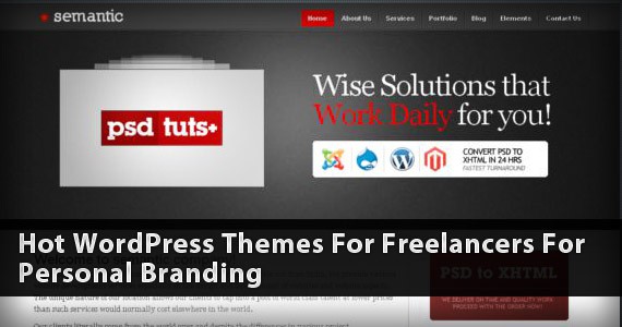
16. Semantic – Premium
The Semantic theme is a great choice for a web design company or a smaller scale business. It is clean, professional and includes many features that are easy to implement and customize.
17. vCard – Premium
For those freelancers who are looking for a simple, electronic resume or business card, vCard (Virtual Business Card) is a solid choice. Its minimal design is clean and professional and allows you to showcase your experience and customize your layout.
18. Multi-theme – Premium
Multi-theme would work for any freelancer in a wide variety of industries. It is a more universal theme and it can showcase portfolios, blogs, and any other services you offer.
19. Fiero – Premium
Fiero is a simple, yet bold theme designed with the artist in mind. If you are a photographer, digital artist, graphic designer or anyone who wants to showcase your amazing designs, this theme is an ideal choice. There are many different color options available or you can use the included PSD files to completely customize the look.
20. Intense – Premium
Intense is suitable for a freelancer with an active business or blog. It includes a custom accordion slider, portfolio pages, PSD files and more.
21. Vendor – Premium
Vendor is another powerful universal theme which will suit any company or business looking to expand on the web. With extensive theme options and customizable widgets, you can control content layout, manage your showcased products and advertising media as well as display your latest tweets, posts and videos.
22. Harmonia
Harmonia is catered to the freelancer who is interested in regular blogging. It is completely customizable and also features many options for showcasing and selling your services.
23. The Novelist
The Novelist is for the serious journalist, writer or copywriter who is more focused on showcasing his/her work. It is the perfect avenue for authors to display snippets of their work or simply to blog about their expertise.
24. Bookpage
Bookpage is a great choice for the freelancer/internet marketer who has an e-book to sell. It comes with payment options, book sample carousel and testimonial functions. And at only $8, it’s a pretty sweet deal.
The right WordPress theme can make or break your website, so its important to choose one that is clear, concise, simple to navigate and overall generally pleasing to the visitor.
Below are some of my picks (free and premium) for the hottest WordPress themes for freelancers:
1. Typominima – Free
Typominima is a great theme for freelancers who want to spotlight their writing and publishing experience. It’s a simple, clean design that can be used to showcase a writing portfolio or simply to use as a blog in conjunction with a freelance writing business. The theme also includes some design customization options.
2. Boldly – Free Download Here
Boldy is a simple, yet robust WordPress theme by Site5.com. It comes with helpful features such as a theme options page, Ajax-based contact form and a Nivo slider. This theme is perfect for the freelancer who wants to start a professional website that lists everything a potential client needs to know.
3. Fotofolio Landscape – FreeDownload Here
Fotofolio Landscape is a WordPress theme designed by Wordspop.com for photographers to showcase their work to clients. This theme would also do well showcasing a designer’s work.
4. Suburbia – Free
Suburbia is a great fit for a freelancer who is interested in showcasing magazine work or a blog. The design is simple and minimalistic and it also has some flexibility such as a logo uploader and a theme options page.
5. Smashing Multimedia – Free
Smashing Multimedia was designed by Smashing Magazine for podcasters, videographers and photographers or anyone who needs to easily embed videos and images, rate them and showcase them in their own blog. The theme comes with layered PSD source files and a help guide as well.
6. Businezz – Free
If you are looking for a “corporate-looking” theme, this design will meet your needs. The home page includes testimonials and real-time news updates from your blog showcased in a clean and crisp layout.
7. Berita – Free
One of my top picks in the “free” category, this theme is simple and easy to navigate. It is a great starter theme for those freelancers who are transitioning to building a company brand for their services. It has a casual feel, yet it allows you to showcase your work and your services in a professional way.
8. Strange – Premium
I like this premium theme because it works for either portfolio-based content or a business website. It offers a variety of customization options that are easy to change even for the novice user. You can modify layout, styling, colors, sidebars and fonts directly from the backend admin.
9. U-Design – Premium
I am slightly biased with this premium theme because I use it for my personal website. I love the clean design and the many layouts available. It is built with SEO in mind as it relates to content placement on the home page and it offers easy customization of colors for backgrounds, links, text, menu links, etc. I have had the theme for a month and I am still finding new ways to customize the site to complete it. It gets a “thumbs up” in my book.
10. MyResume – Premium
MyResume is a premium theme suited for the freelance professional who needs a digital resume to showcase to clients. It is sleek and easy to use and allows the user to add new pages and tabs and a custom portfolio as well. It also integrates well with social networking sites and includes sections for services and testimonials.
11. Client Machine – Premium
To be honest, this design has me a bit envious and I may have purchased it had I not already decided on a theme. It offers a clean, professional design and it comes with features such as built-in invoicing and the ability to create professional project proposals. You can also display testimonials, contact forms and social media icons with customizable widgets. A rotator is available as well so you can showcase your specialties by choosing from a library of 20+ icons.
12. Studeo – Premium
Studeo is a feature-packed premium WordPress theme designed for any freelance creative professional or a creative agency. It includes a filterable portfolio, custom widgets and custom page templates.
13. Rockfolio – Premium
Rockfolio is a simple premium theme with high-end coded CSS, compatible with all the major browsers. It is a great theme for freelancers starting a small business or simply showcasing their work skills. Some highlighted features include easy to edit html coding, lightbox portfolio sections with gallery view options, and PSD files.
14. Classica – Premium
The Classica theme puts your talents and skills front and center. It is a clean and beautiful design that allows you to present your work professionally. It is a great theme for any type of artist whether graphic, motion, print or web.
15. Lightspeed – Premium
Lightspeed is a clean, versatile theme perfect for freelance professionals. It includes the Content Composer v2 which allows you to drag & drop your content and layout with ease. Version 2 of the Content Composer comes with a templates system that allows you to continually utilize Content Composer templates by saving, loading, importing and exporting them with other themes that use this same system.
16. Semantic – Premium
The Semantic theme is a great choice for a web design company or a smaller scale business. It is clean, professional and includes many features that are easy to implement and customize.
17. vCard – Premium
For those freelancers who are looking for a simple, electronic resume or business card, vCard (Virtual Business Card) is a solid choice. Its minimal design is clean and professional and allows you to showcase your experience and customize your layout.
18. Multi-theme – Premium
Multi-theme would work for any freelancer in a wide variety of industries. It is a more universal theme and it can showcase portfolios, blogs, and any other services you offer.
19. Fiero – Premium
Fiero is a simple, yet bold theme designed with the artist in mind. If you are a photographer, digital artist, graphic designer or anyone who wants to showcase your amazing designs, this theme is an ideal choice. There are many different color options available or you can use the included PSD files to completely customize the look.
20. Intense – Premium
Intense is suitable for a freelancer with an active business or blog. It includes a custom accordion slider, portfolio pages, PSD files and more.
21. Vendor – Premium
Vendor is another powerful universal theme which will suit any company or business looking to expand on the web. With extensive theme options and customizable widgets, you can control content layout, manage your showcased products and advertising media as well as display your latest tweets, posts and videos.
22. Harmonia
Harmonia is catered to the freelancer who is interested in regular blogging. It is completely customizable and also features many options for showcasing and selling your services.
23. The Novelist
The Novelist is for the serious journalist, writer or copywriter who is more focused on showcasing his/her work. It is the perfect avenue for authors to display snippets of their work or simply to blog about their expertise.
24. Bookpage
Bookpage is a great choice for the freelancer/internet marketer who has an e-book to sell. It comes with payment options, book sample carousel and testimonial functions. And at only $8, it’s a pretty sweet deal.
 Florida Flourish is a good example of a total symmetric website
 Duplos uses an asymmetrical layout which works really well.2. Dominance and Priority
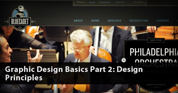
 Area17 emphasizes the dominant element in the top left corner and the welcome message pulls you in as well because of the color.3. Proportion
 Bluecated Interactive uses proportion to draw the attention on the image.4. Contrast
 eHarmony's "Find My Matches" button stands out because of a good use of contrast.5. Rhythm
 David Desandro's portfolio follows a very regular, progressive rhythm6. Harmony and Unity